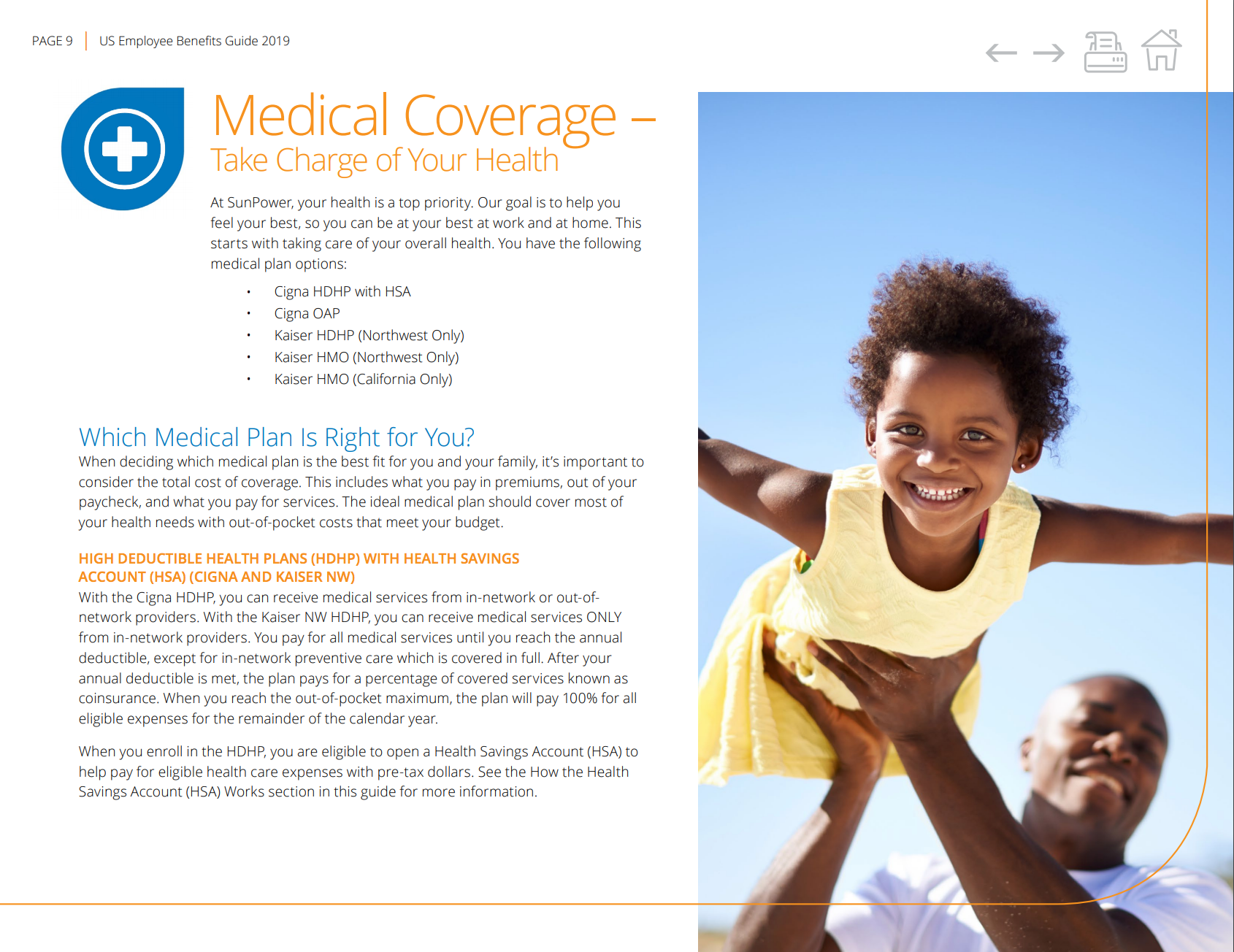
DESIGN CHALLENGE: "More Power to You" became the theme of this guide. The client communicated that having images which show the strength and diversity of their employees was the key for communicating the benefits they offer their employees. We wanted to include images that also incorporate elements of their black and gold logo. Finding the right images and bleeding them off the page gave them unity and importance. The cover image clearly conveys an open, friendly environment--perfect for starting the benefits discovery process in the pages to come. The interior pages showcase graphical elements to help employees gain confidence in selecting the right benefits for themselves and their families.
LOOK & FEEL: Friendly, Educational, Powerful.