
DESIGN CHALLENGE: The client requested a communication campaign as playful as their theme parks. Once the images for the Benefits Guide were developed, we rolled them into our layout. Each piece, though different in content, seamlessly works together as a whole. Sparkles, fun theme park photography, and a dynamic purple and blue color palette came together beautifully. Katy Perry might agree, this campaign has the feeling of fireworks!
LOOK & FEEL: Color Burst, Sparkles, Active.
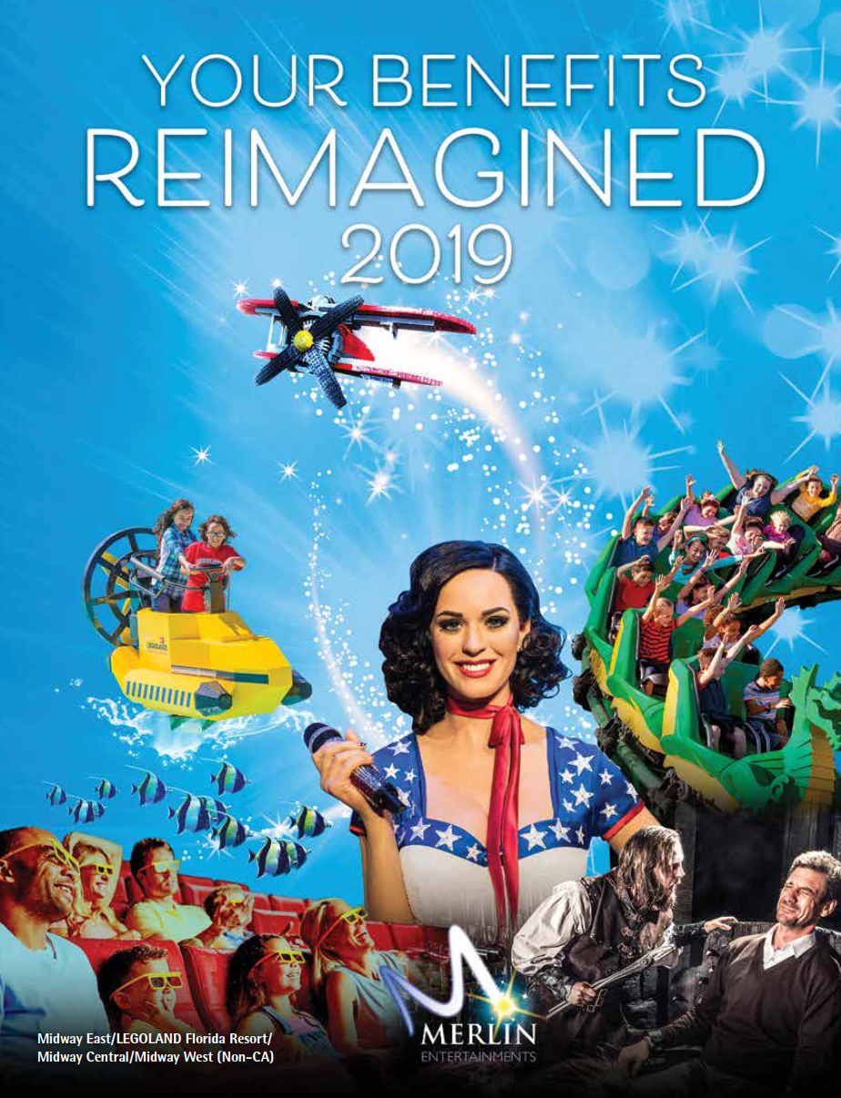
Cover of Benefits Guide
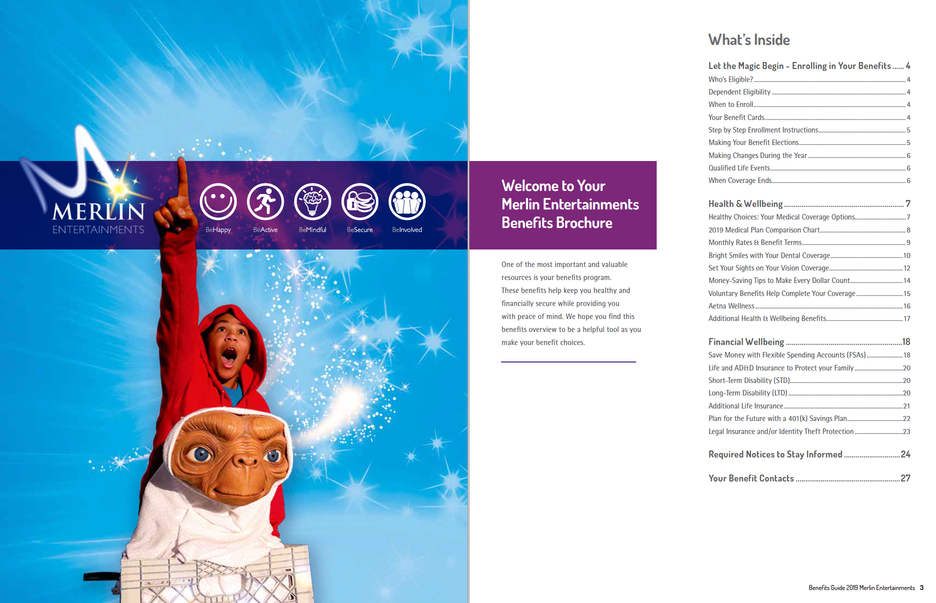
Opening spread of the Benefits Guide.
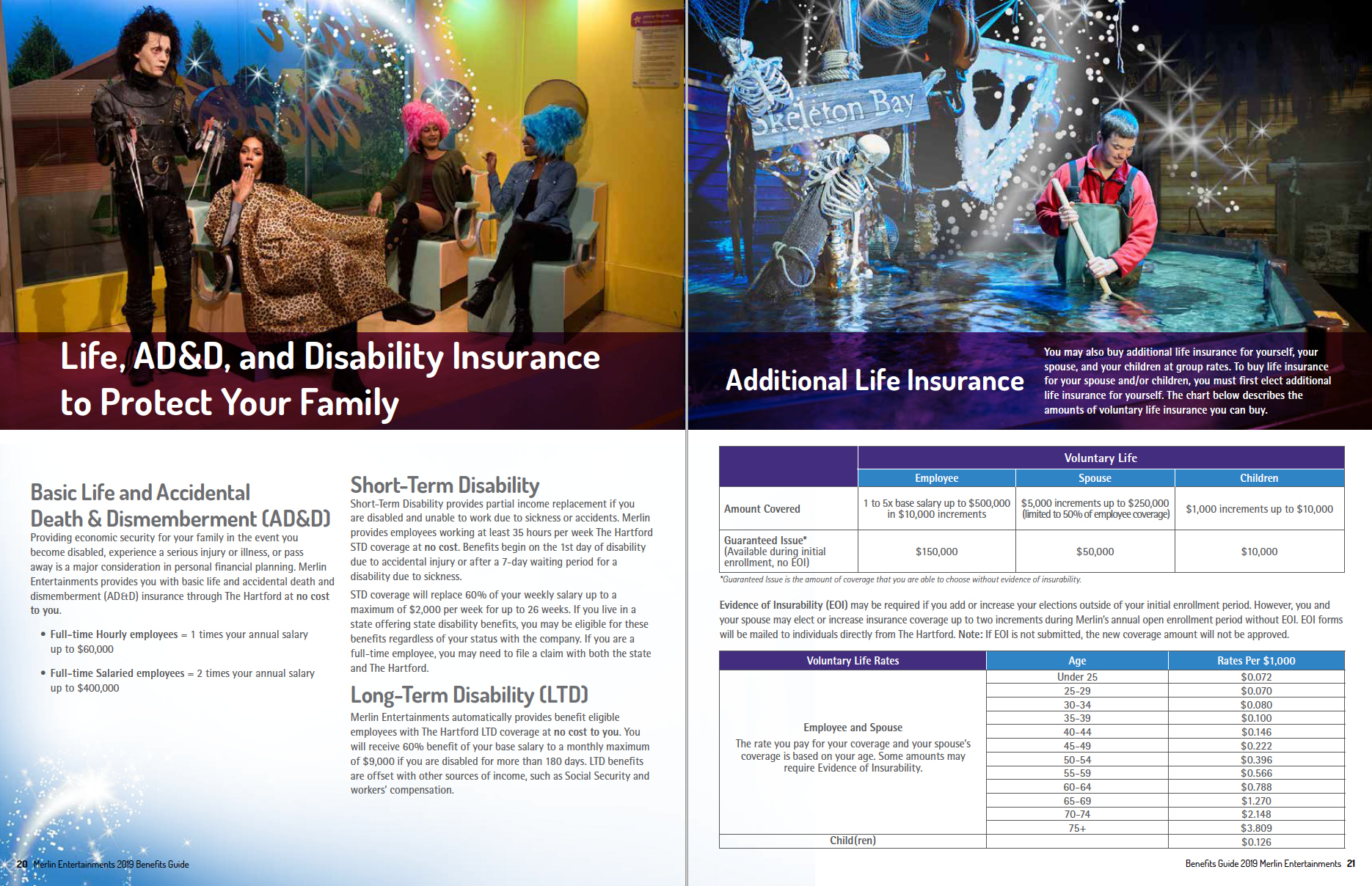
Additional spread of the Benefit Guide.

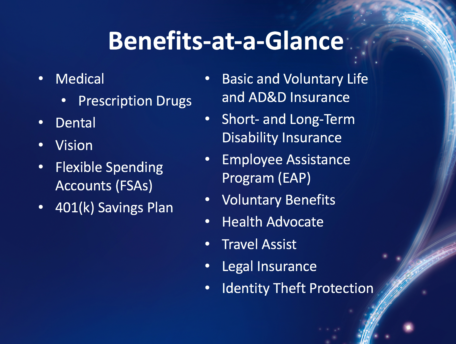

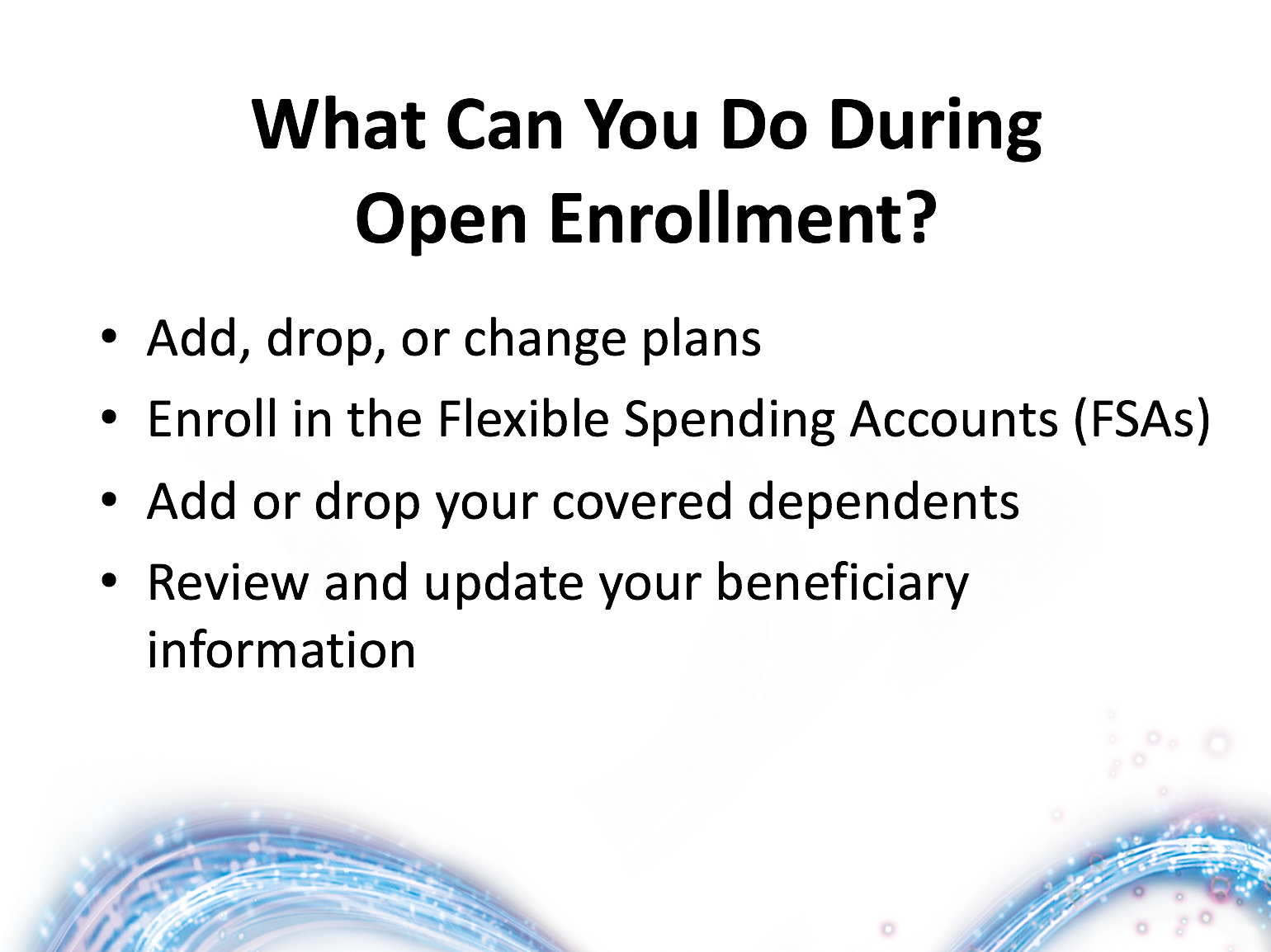

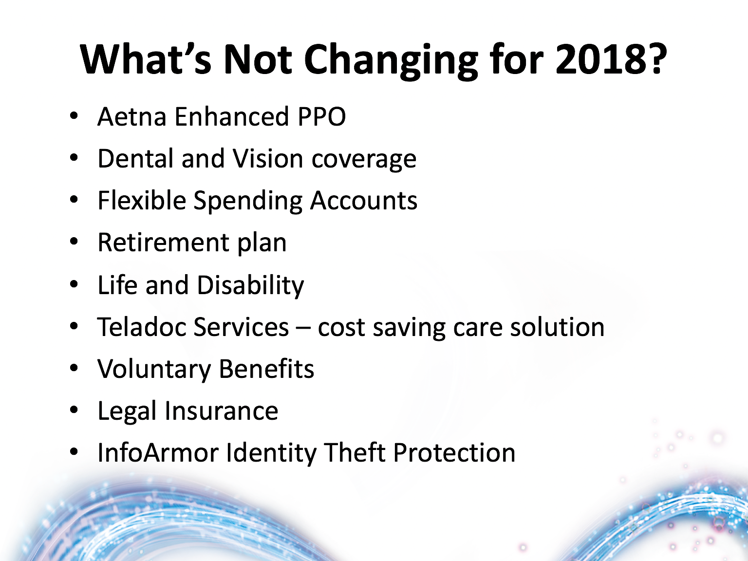

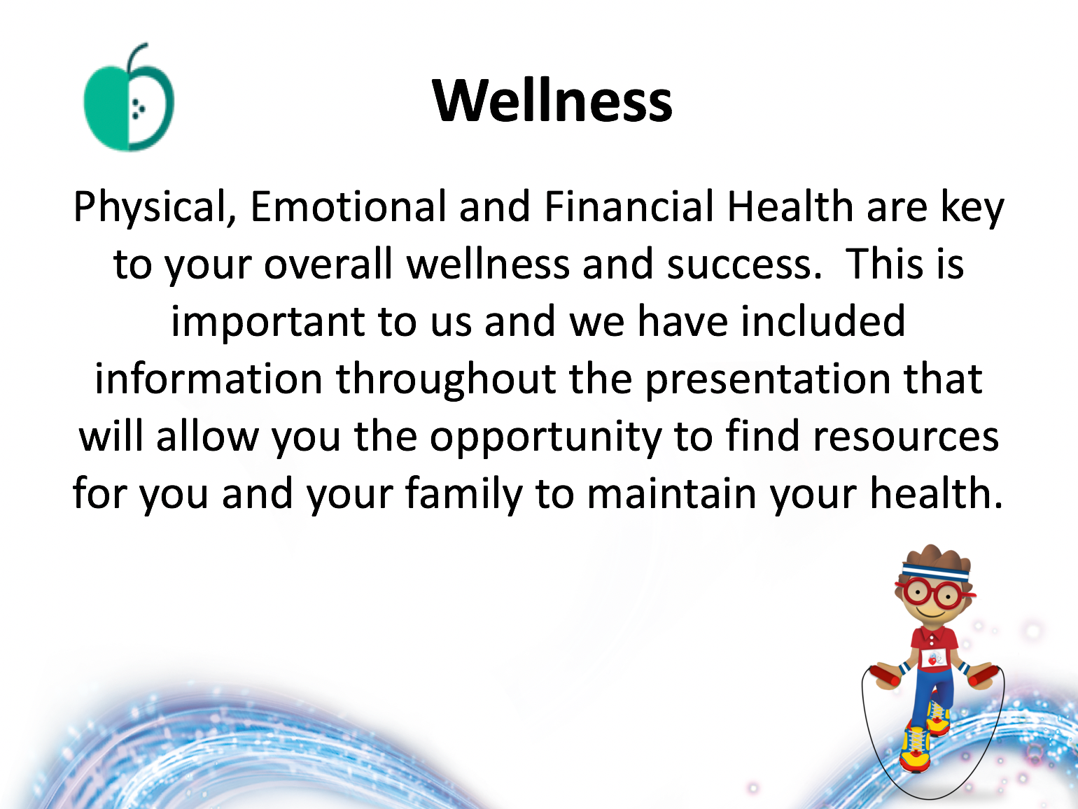

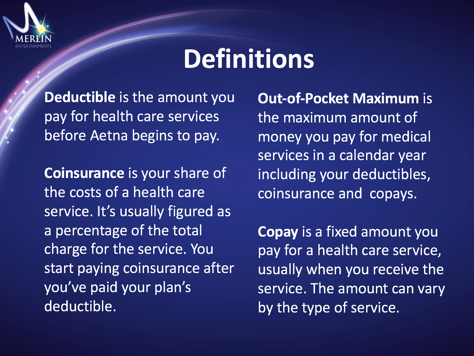

PowerPoint Presentation.
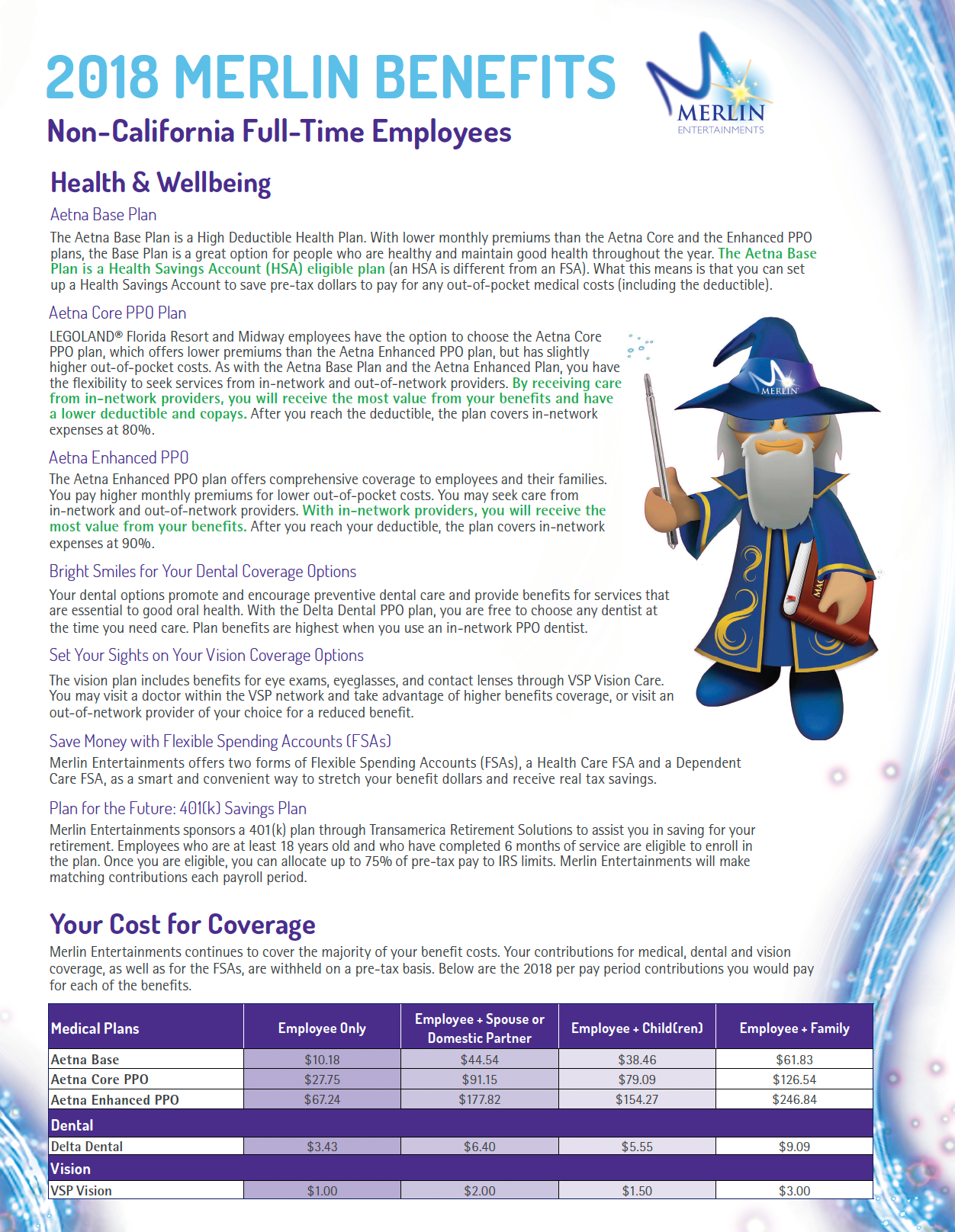

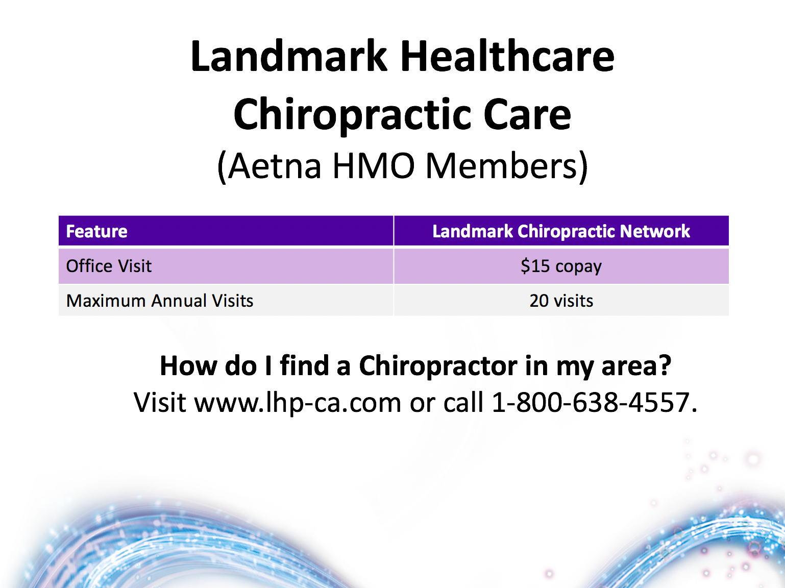
Various Flyers.