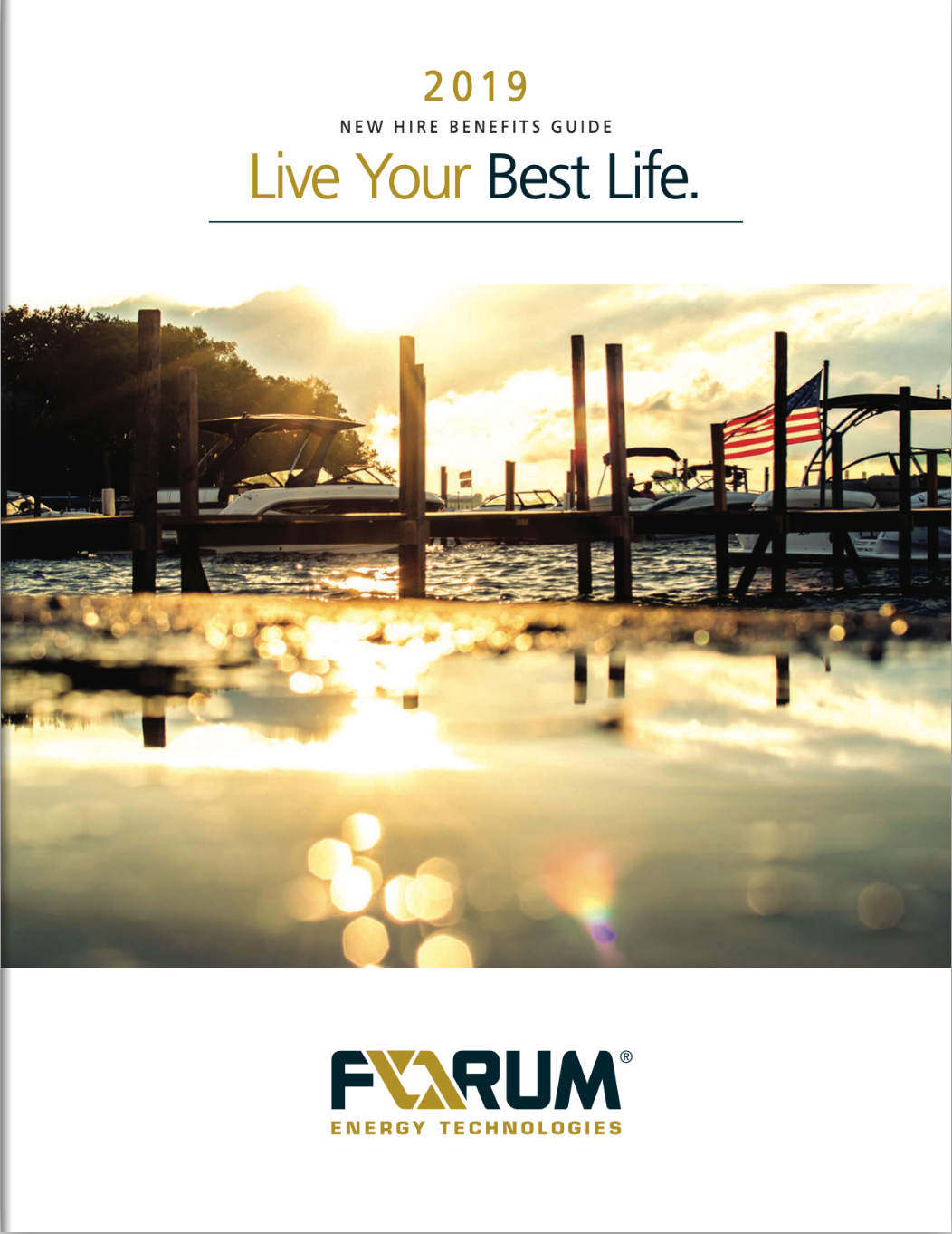
DESIGN CHALLENGE: "Live Your Best Life" became the theme of this guide. The client communicated that having images which showcased diversity and family were key for telling the story of the benefits they offer their employees. Discovering that the client had a beautiful logo and color palette had a huge impact on the decisions made by the design team. We used images that had elements of the navy blue and gold logo colors. Finding the right images and bleeding them off the page gave them unity and importance. The real challenge was in the selection of the cover image. The final selection that made it onto the cover is the perfect image, leaving the viewer to imagine an all-American weekend played out with family on the lake...living their best life.
LOOK & FEEL: Patriotic, Sun-kissed, Traditional.