
DESIGN CHALLENGE: Clean and modern are two words to describe this campaign. In order to achieve that objective, we determined that a minimalist font and layout selection would be best. In addition, we added bold pops of green to enhance the design. We selected images that were monochromatic in color to make the accent colors of green and blue stand out more. Overall, we took the right path to be able to present to the client a beautiful, cohesive campaign. High fives all around!
LOOK & FEEL: Clean, Modern, Pops of Color.

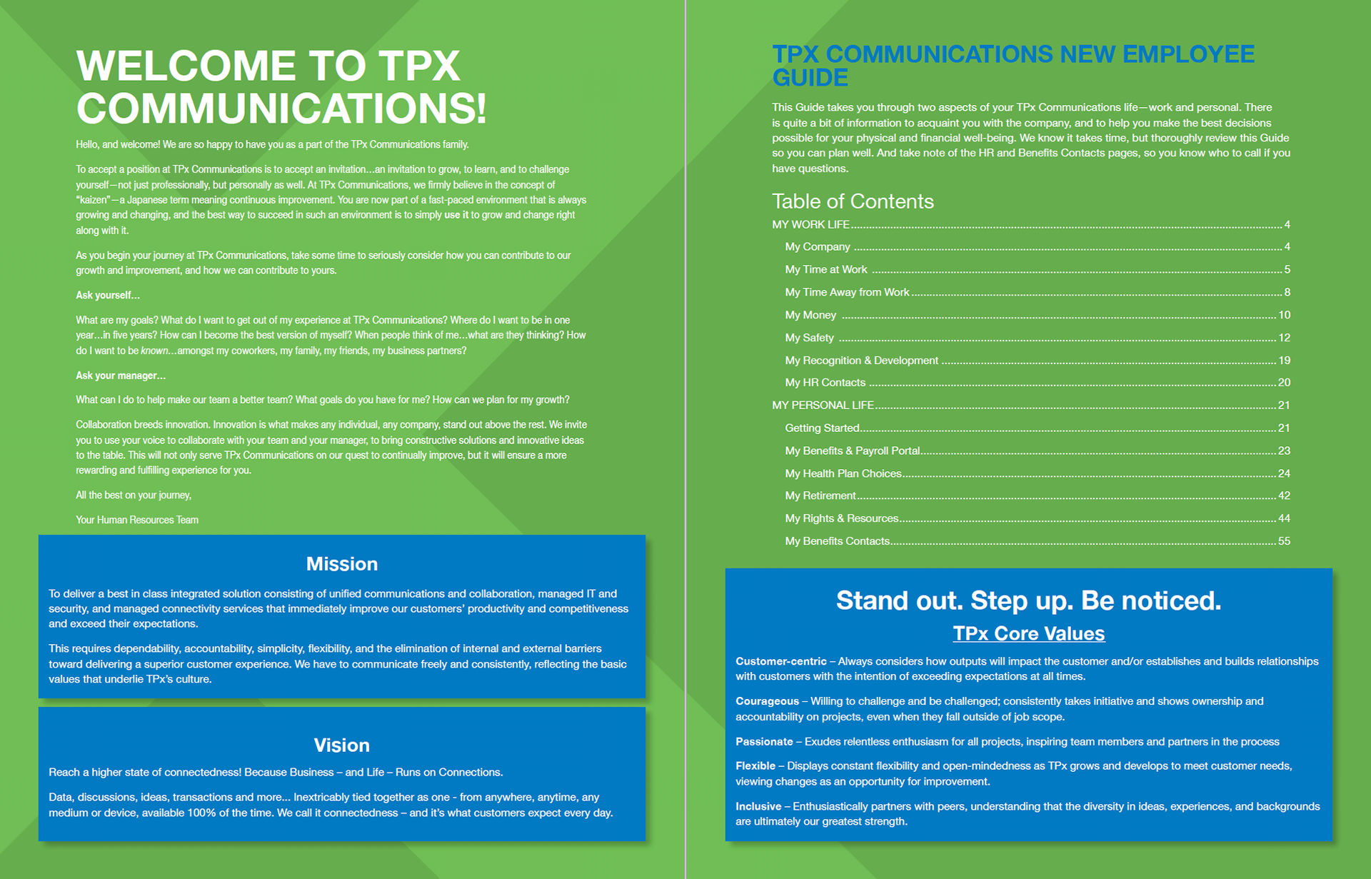
Cover of Benefits Guide
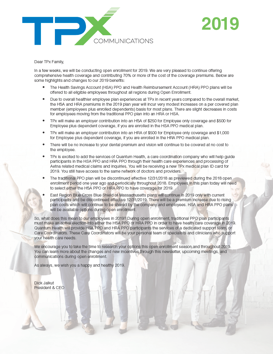
Opening spread of the Benefits Guide.
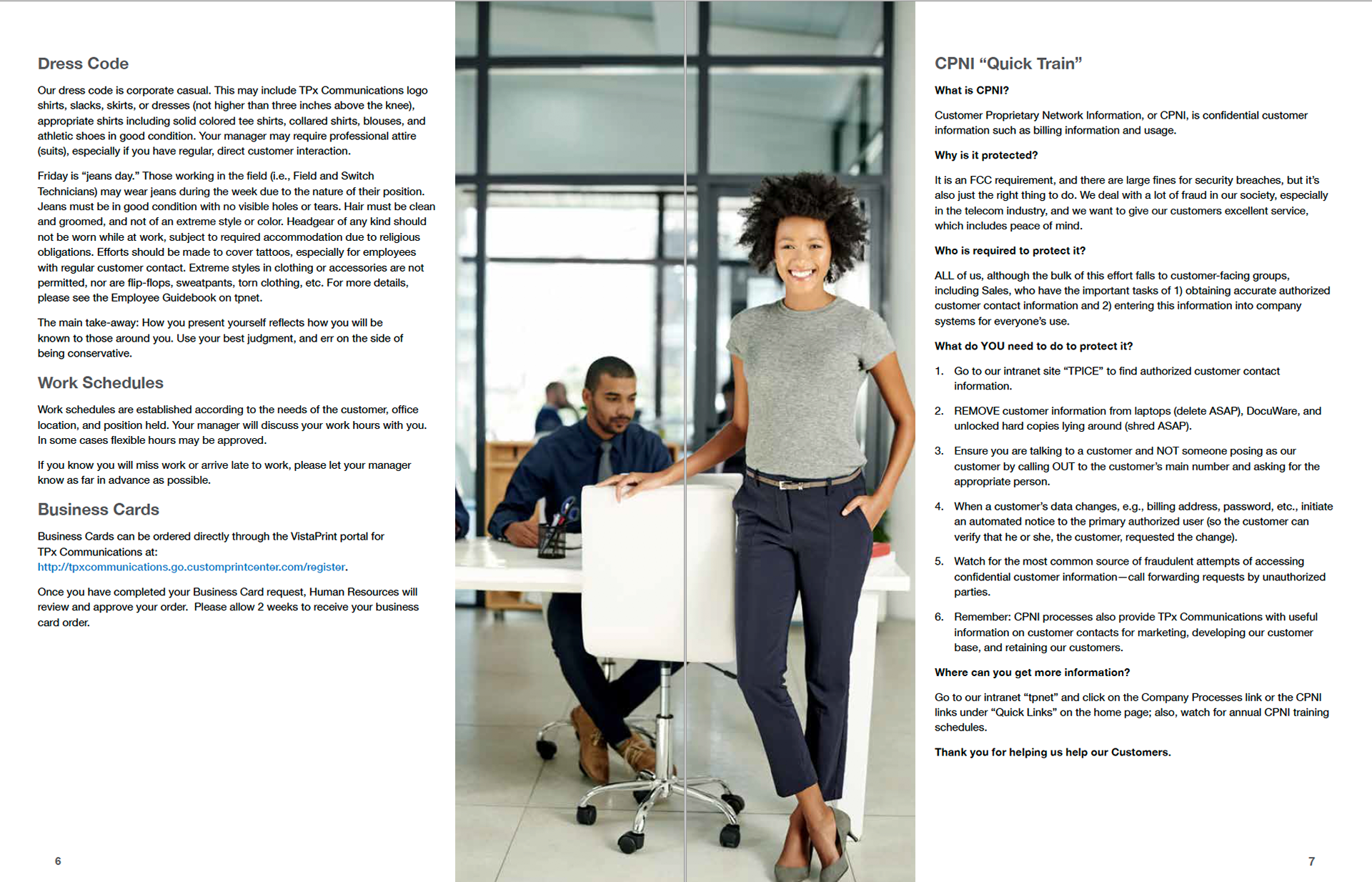
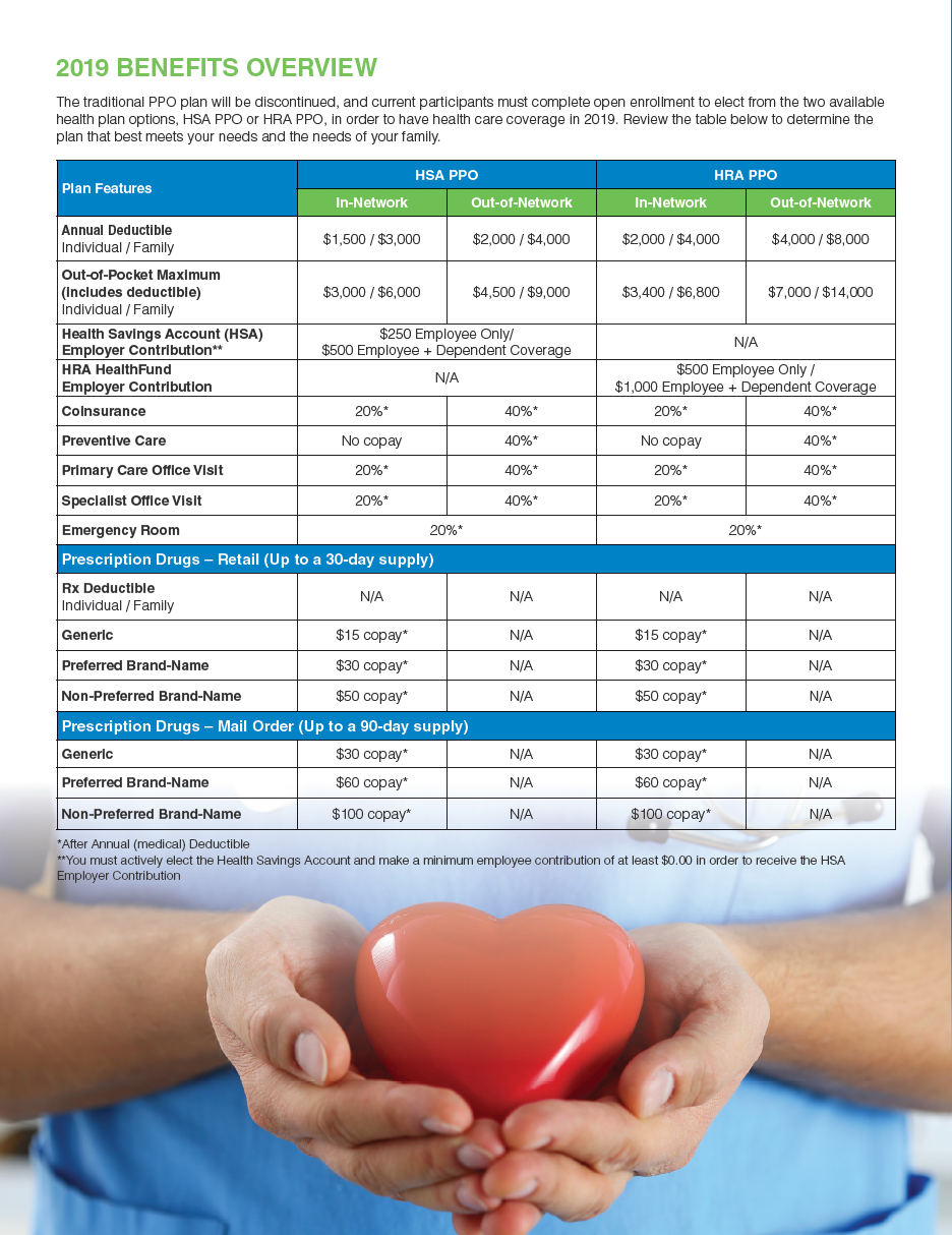
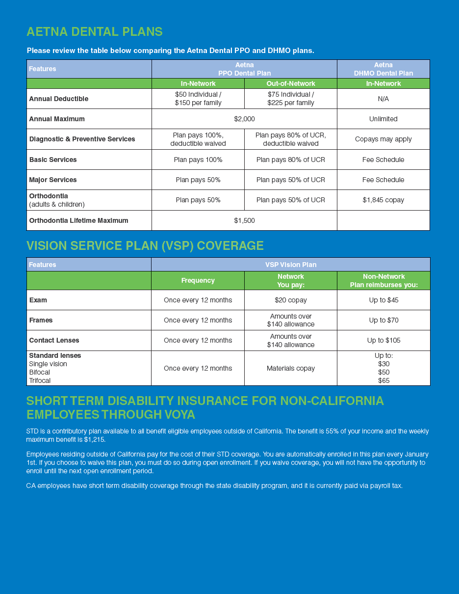
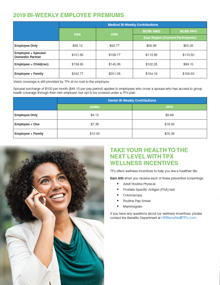
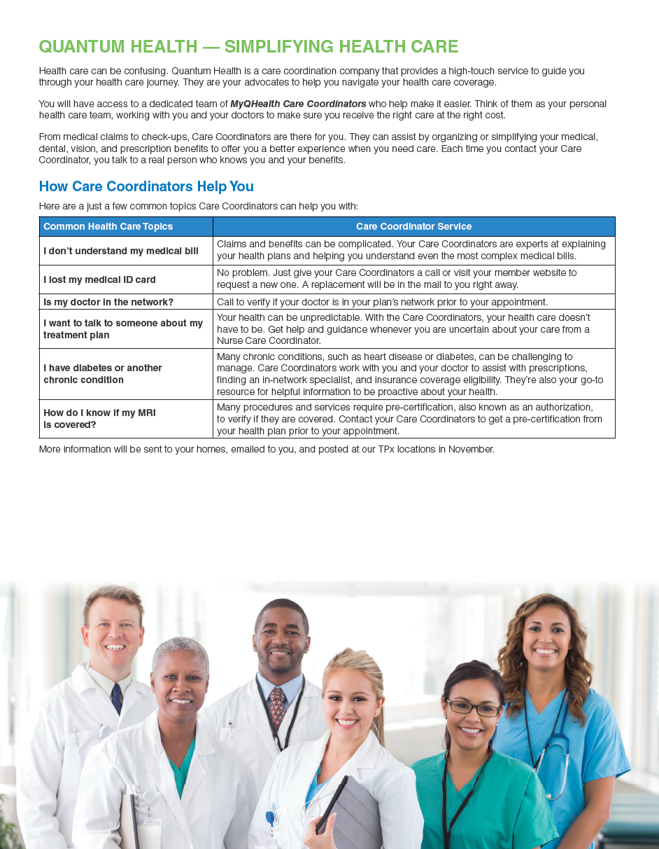
Additional spread of the Benefits Guide.

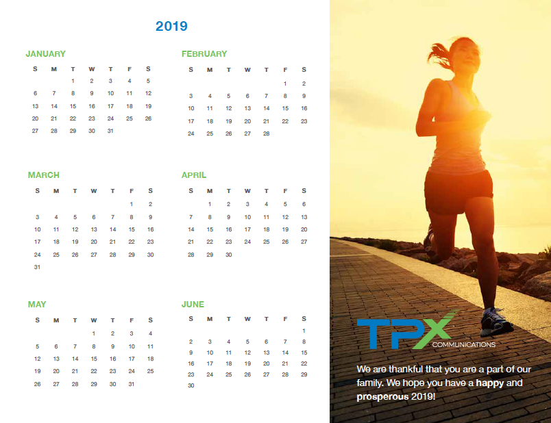
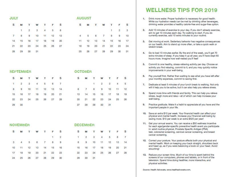

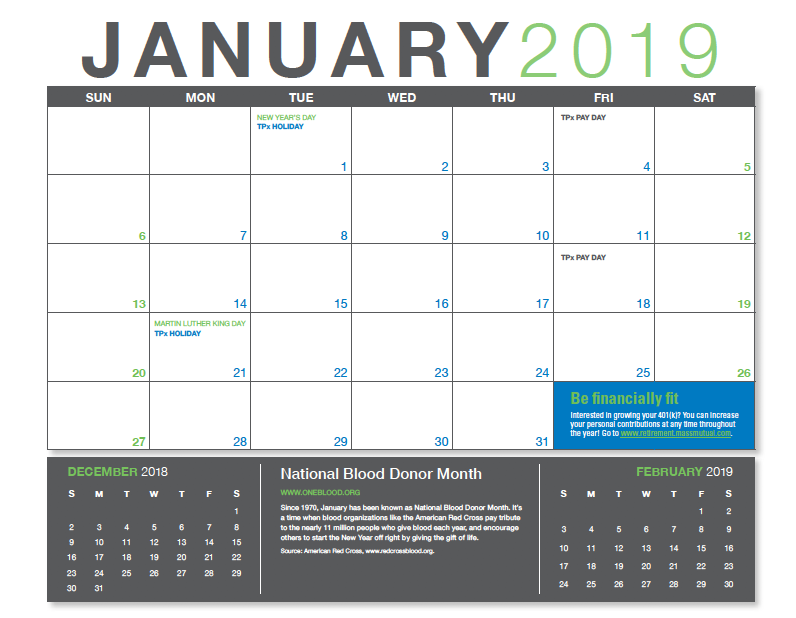

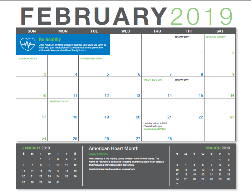

Calendar design.
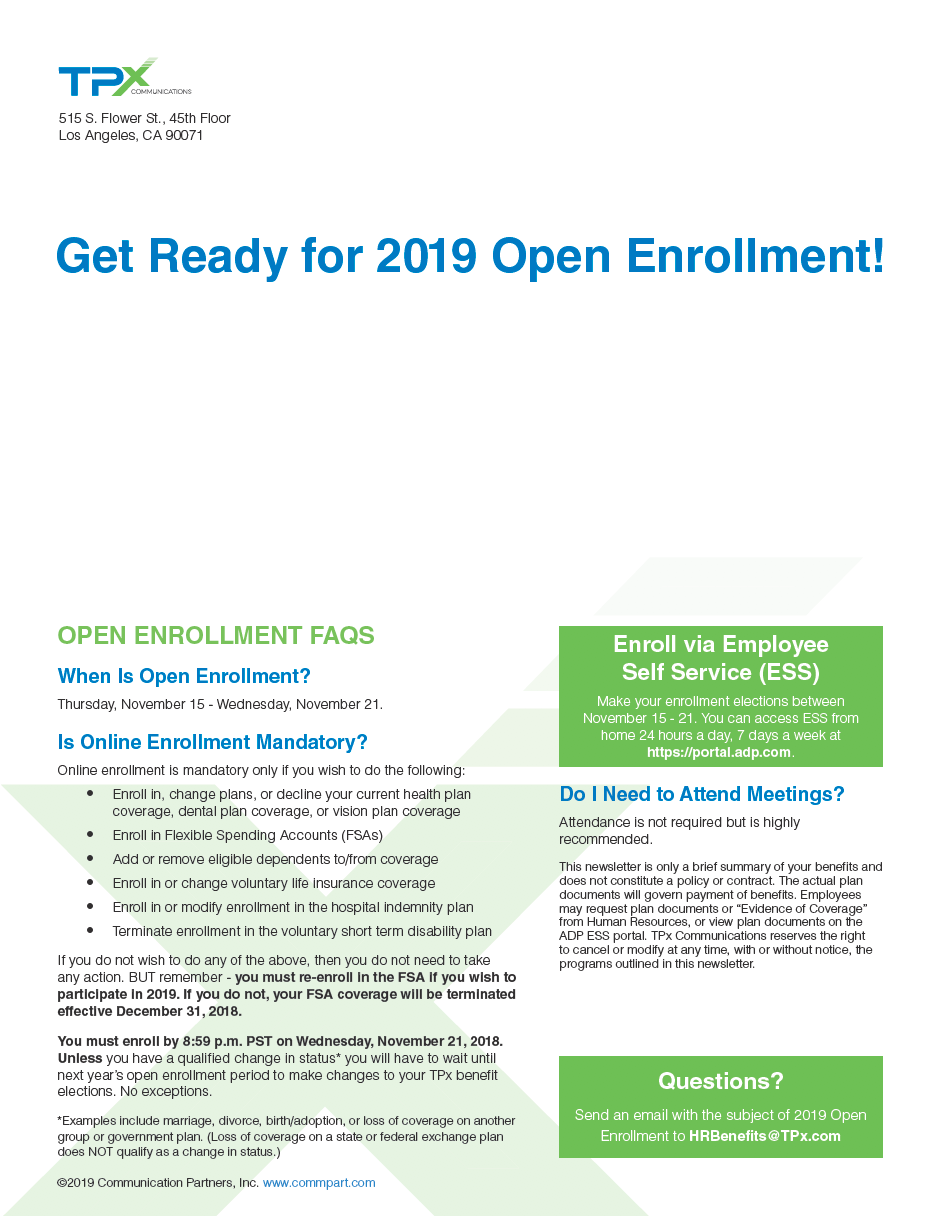
Newsletter design.