
DESIGN CHALLENGE: When you are the maker of high-end digital products, using youthful images in your employee benefits campaign makes for a smart choice - helping to celebrate their cool and playful culture. We were given amazing photography by the client and with the directive to protect white space within the design in order to allow images to be at the forefront on the pages. Knowing this, we went into the design process with a commitment to addressing the client's need and to build upon them. The result was a vibrant, colorful, and "Level 10" experience. Pops of orange and clean lines incorporated in all charts and graphs, along with the effective use of white-space helped elevate this campaign to its highest potential. Our design team and the client thought this campaign completely rocked.
LOOK & FEEL: Loud, Hipster, Bold.
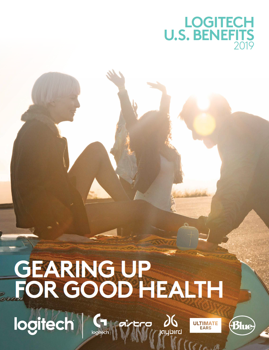
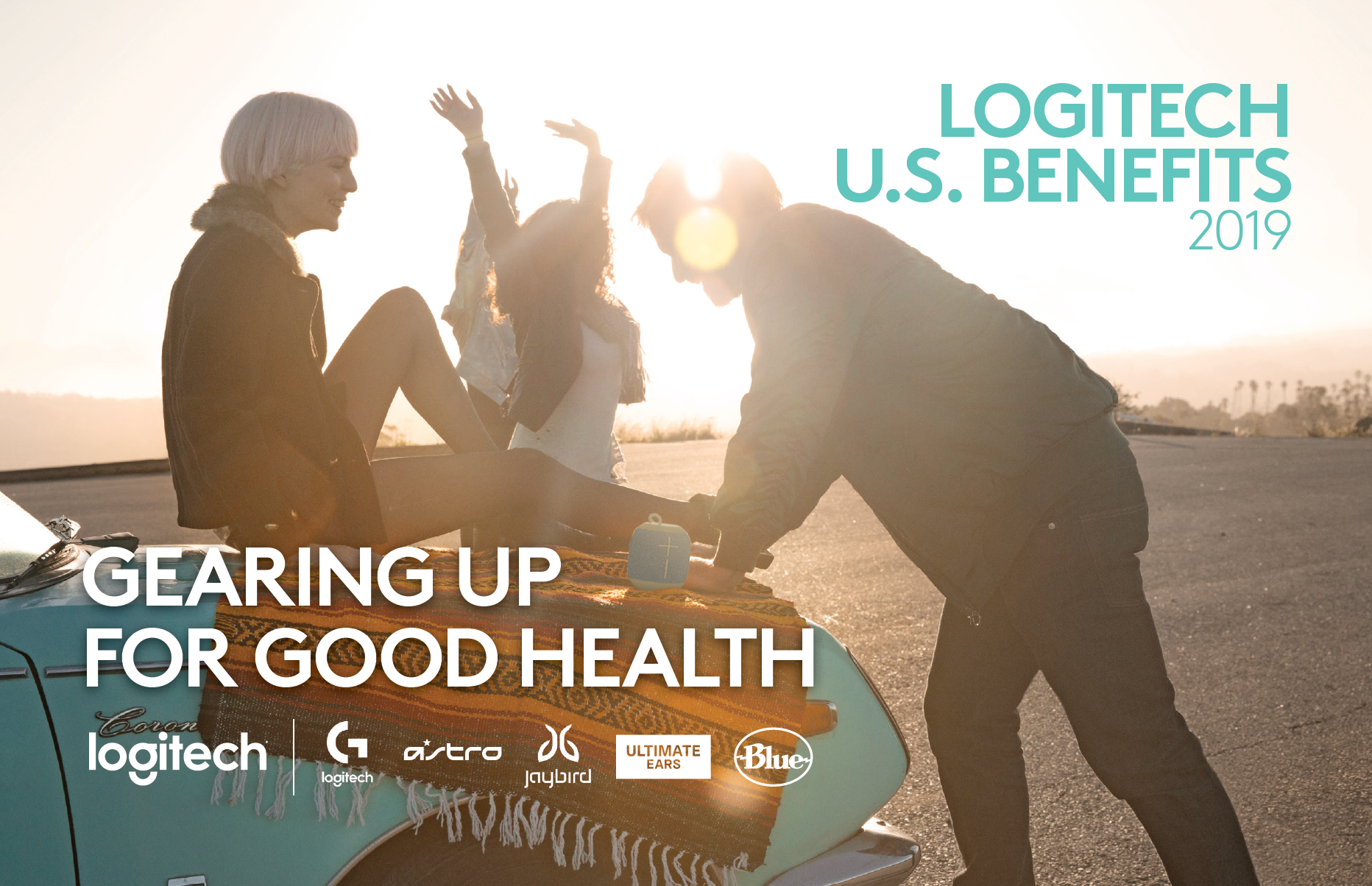
Cover of Benefits Guide
Opening spread of the Benefits Guide.
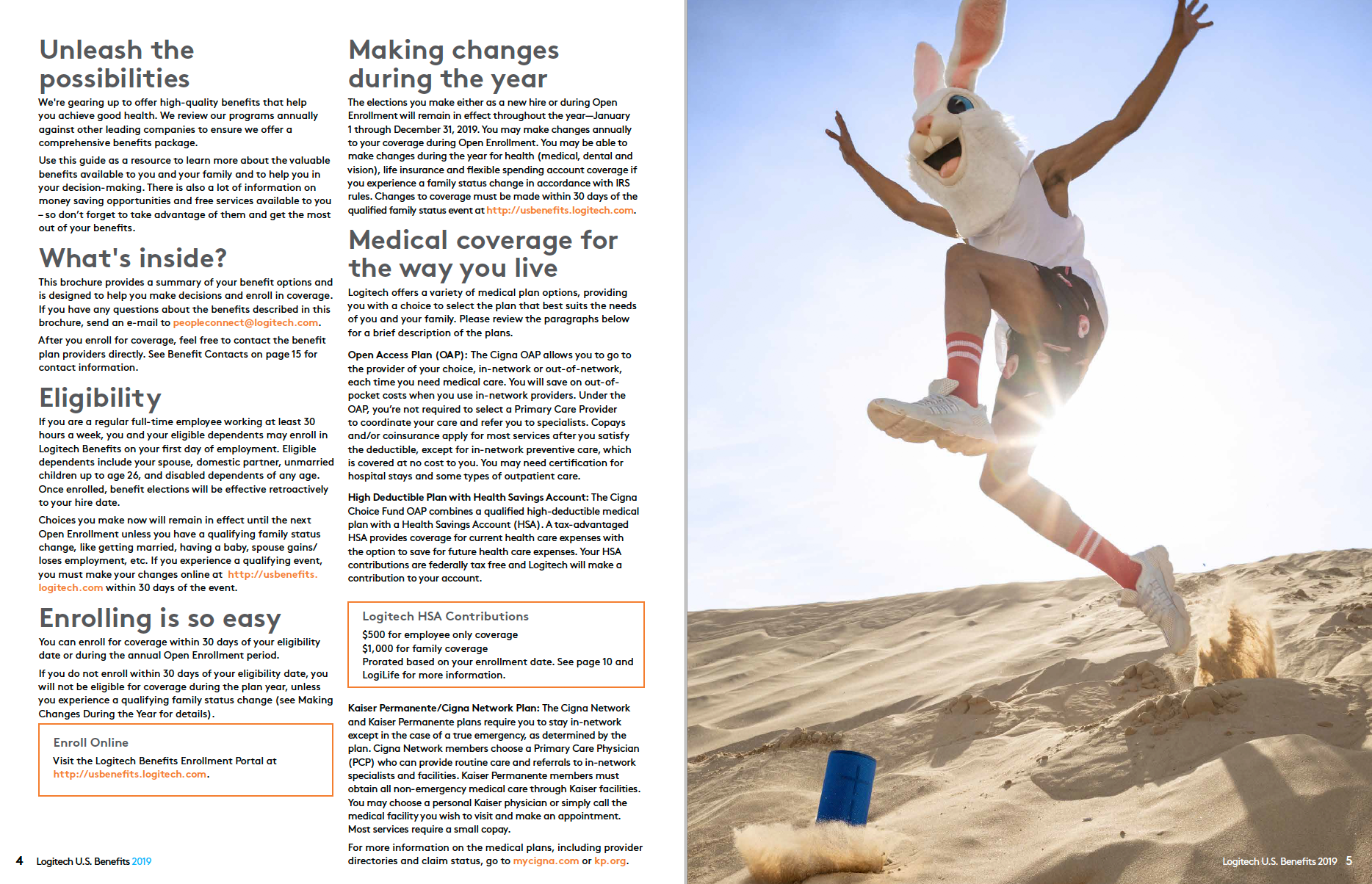
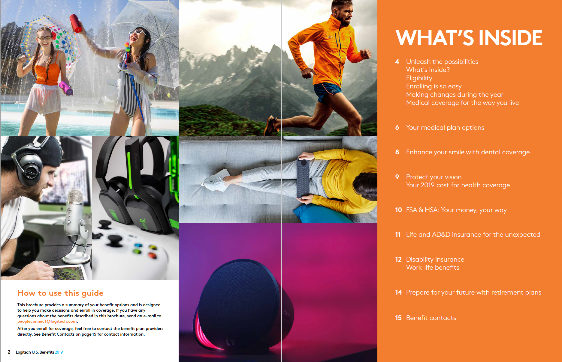
Additional spread of the Benefit Guide.
Poster design and layout.
Postcard design and layout.
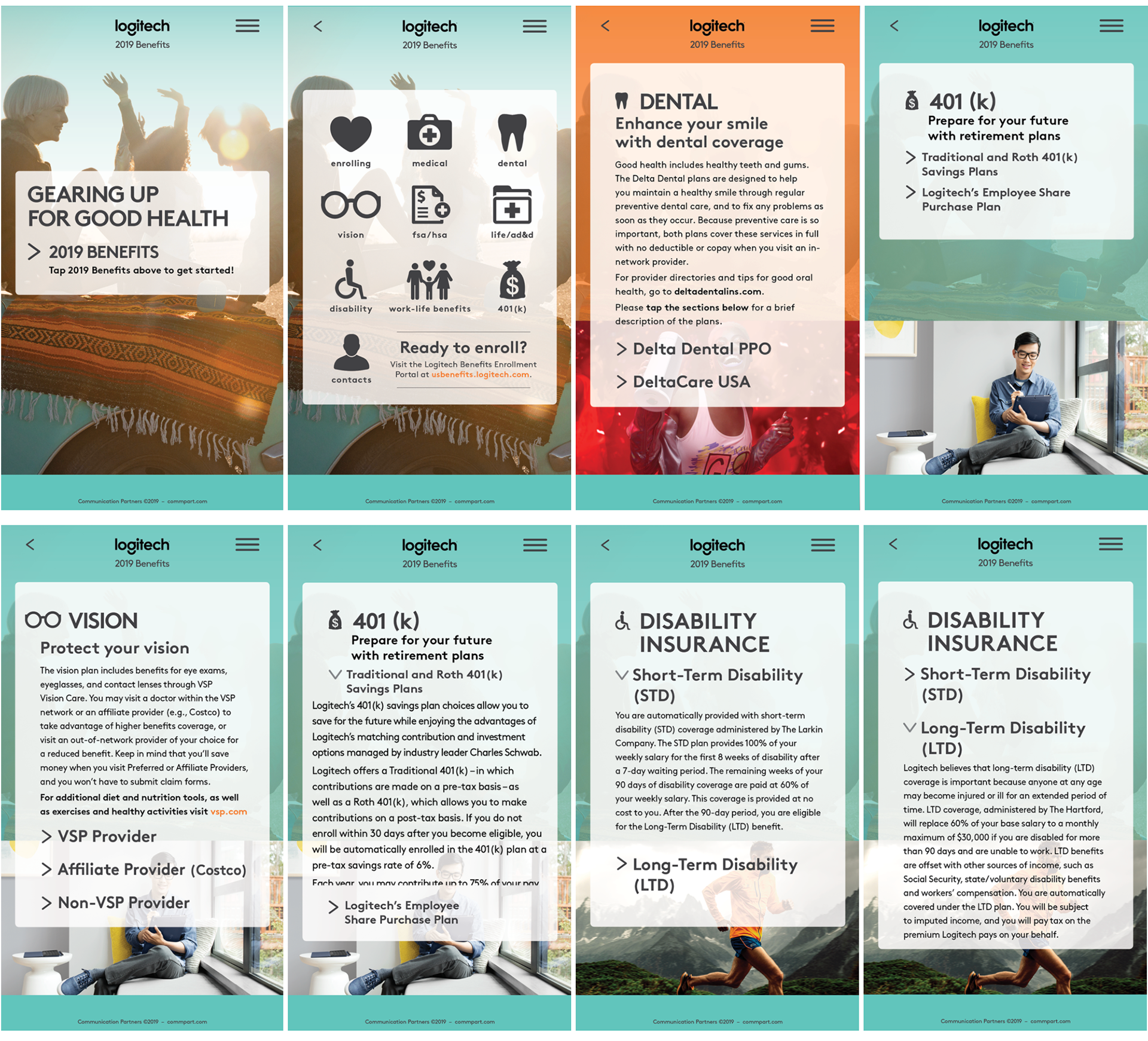
Tiled cellphone platform demo.

Newsletter design and layout.
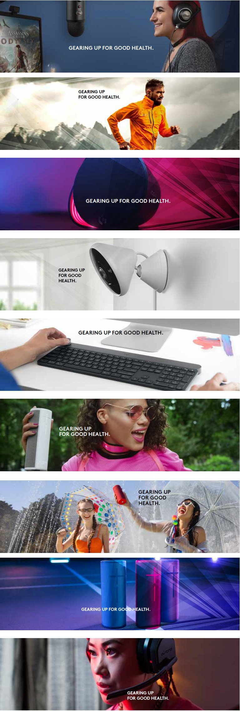
Website banners